Georg Vetter

Data Scientist
View my Medium Profile
Visualize High Dimensional Data in 2D via t-SNE
Introduction
Data visualization plays a crucial role in the analysis of complex datasets. This project investigated how high-dimensional data can be effectively visualized in two dimensions to visually identify potential clusters or patterns. The data used was the MNIST dataset, a well-known benchmark for machine learning, which contains handwritten digits from 0 to 9.
Methodology
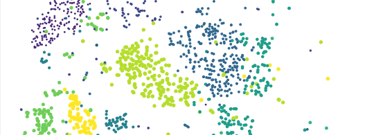
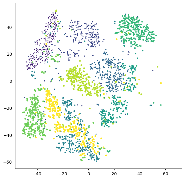
The t-SNE (t-distributed Stochastic Neighbor Embedding) algorithm was used to reduce dimensionality. This makes it possible to transform the data into a low-dimensional representation while largely preserving the similarity between the data points in the higher dimensions. The visualization was then performed in the form of a scatterplot, with each class of digits represented by a separate color.
Implementation
The data was loaded from the MNIST dataset using scikit-learn. Subsequently, t-SNE was applied, whereby two dimensions were defined for the visualization. The resulting coordinates were displayed in a scatterplot, with each digit category identified by a specific color. By viewing the scatterplot, the separation of digit clusters could be visually assessed.
Results
The visualization showed that the different digit classes tended to be well separated from each other. In particular, there was clear clustering and some separation between classes. These observations suggest that t-SNE is a suitable method for visualizing the MNIST dataset and can effectively represent potential cluster structures.
Business Case
Visualization of the MNIST dataset provides critical value to organizations in areas such as optical character recognition, automated document processing, and fraud prevention in banking. By identifying patterns and clusters in handwritten digits, companies can optimize their classification algorithms, improve the performance of their applications and thus increase customer satisfaction. Effective use of visualization techniques shortens development cycles and contributes to faster time-to-market for more efficient classification applications, which in turn strengthens competitiveness and brand image.
What I learned
This project learned how to apply the t-SNE algorithm to reduce the dimensionality of data in order to visualize complex structures in a high-dimensional dataset such as the MNIST dataset. The visualization techniques allowed for easy interpretation of results and detection of data clusters through different coloring of digit classes in the scatterplot. This hands-on experience not only provided insights into the workings of t-SNE and the structure of the MNIST dataset, but also deepened the understanding of data analysis and visualization.